Proagrica Website
Building a better website for a global agriculture and digital farming brand
Overview
Proagrica is a world-leading provider of information and analytics for professional and business customers within the agriculture and animal health industries. The group serves customers in more than 180 countries.
In recent years, Proagrica has gone through a period of strategic business acquisitions in the agriculture data transformation market and significantly expanded their product and solution offering.
The Challenge
Create Deeper Relationships with Customers
Our challenge was to educate customers about Proagrica and their improved competitive standing, highlight their USPs and values, and showcase their new wider products and solutions offering.
We needed to provide an effective information architecture and content hierarchy for both prospective and existing customer to navigate the website and find content relevant to them.
My Role
I lead the UX research, conducted stakeholder interviews, card sorting workshops, analysed the results and collaborated with Proagrica’s customer insight team to design the information architecture for the site.
I executed wireframes and UI design elements and collaborated with a lead designer to produce visual designs and design guides.
I was also responsible for the front‑end development and CMS development before handing it off to Proagrica’s internal dev team for integration with CRM and Analytics services and deployment.
Research & Discovery
We conducted stakeholder workshops and card sorting exercises to drive our planning phase.
Stakeholder workshops
In order to better understand business requirements and build agreement across project supporters I conducted a series of discovery workshops with team members and key stakeholders in Proagrica’s Agronomy, Manufacturing and Animal Health teams in UK and US.
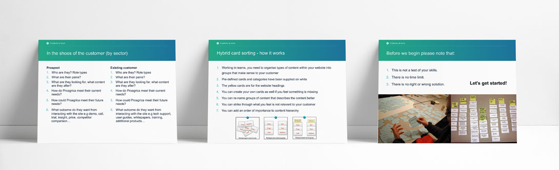
Card sorting
I then set up a moderated open card sorting workshop with Proagrica subject matter experts (sales, marketing, customer services, technical support). While they worked in groups of three, I watched and listened to their conversations. This gave me a better understanding of how they thought about particular content items.
Based on results of the open card sorting I defined the initial set of cards and used Optimal Workshop to set up an online hybrid card sorting exercise with a panel of existing Proagrica users and potential/prospective customers who have had no prior contact with Proagrica.
The Design Process
Structuring Content First
Before starting any design, I spent a great deal of time making sense of existing content and the range or different products and solutions on offer. I faced particular challenges with labelling and terminology as I found that language varied between different sectors and groups of users.
I teamed up with Proagrica’s SEO partner Altair Media to work out the final terminology and labelling.
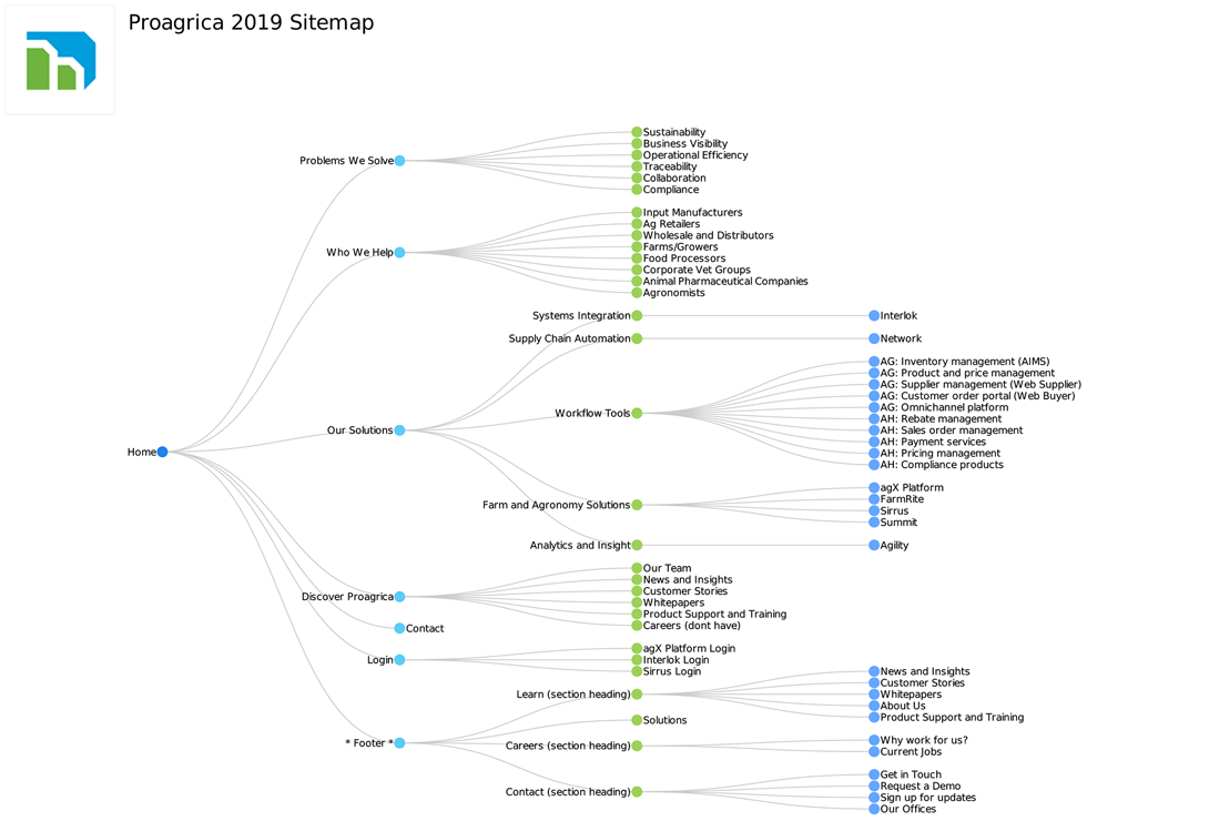
Combined knowledge from the stakeholder and card sorting workshops helped me design a persuasive architecture. The sitemap was built in Dynomapper and was also used for content planning and copywriting.
To move forward with the design I used Sketch to create sets of detailed wireframes. This approach was beneficial in showing our stakeholders design progress.
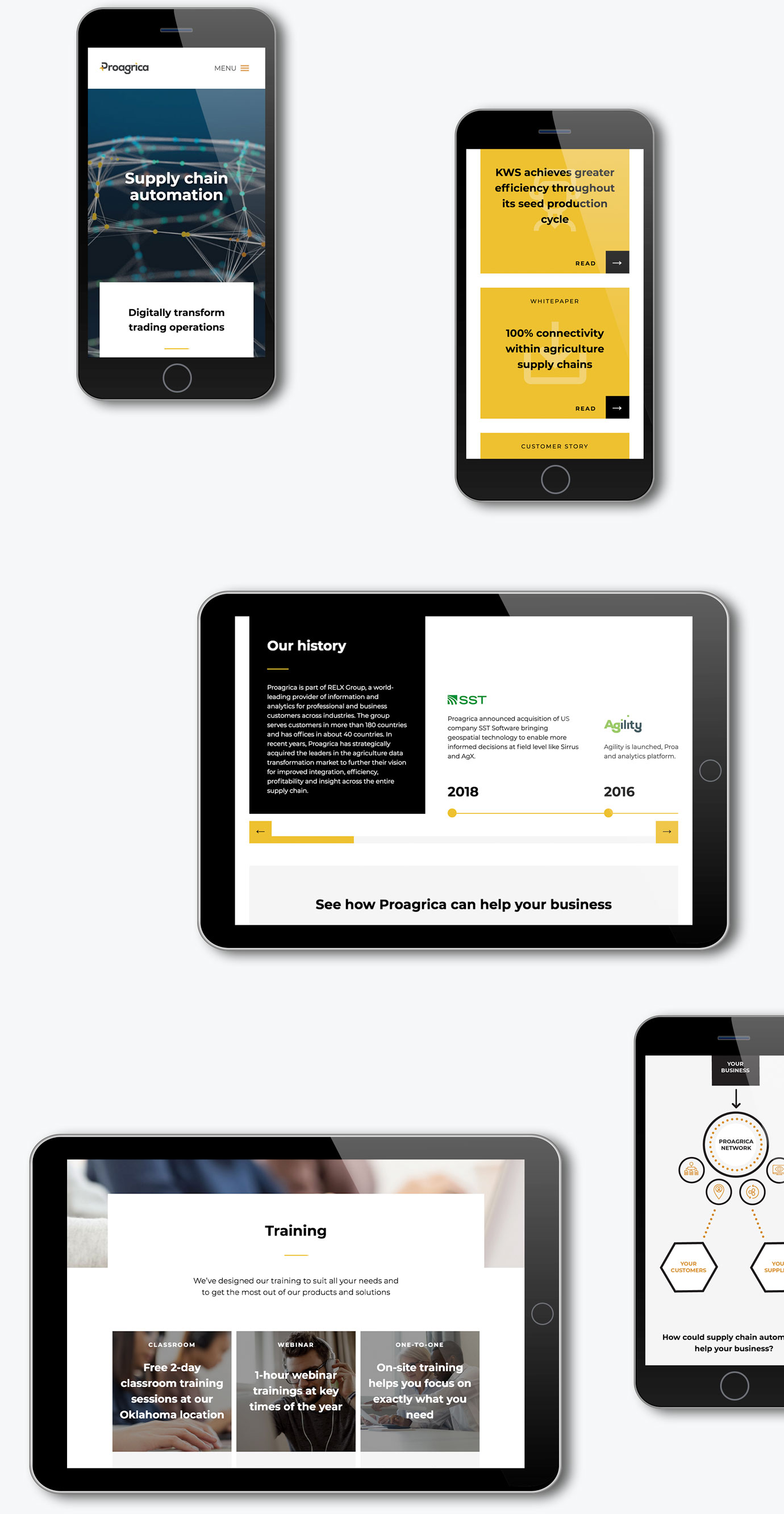
The Solution
After nine months of research, design and development, the new site launched in March 2020 – an impressive achievement by the team, considering that it was a complete redesign and rebuild from scratch.
The new website’s architecture is structured around customer problems and solutions rather than individual products. With this approach, we hoped to present Proagrica as a strategic partner focused on helping their customers solve challenging problems.